Dashboard Overview
The homepage provides key metrics and visualizations across different services and platforms. Here's what each chart shows:
Cost Analysis
Current Month Cost Comparison
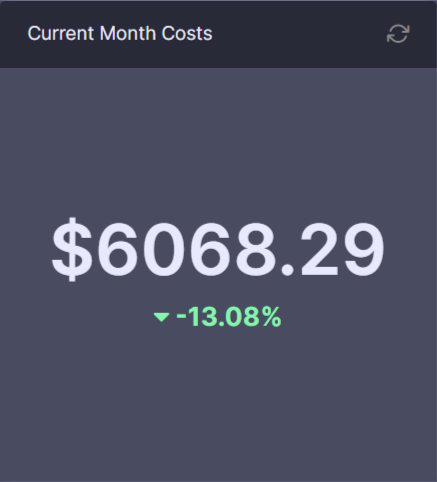
This chart displays:
- Current month's costs to date
- Comparison with the same period last month
- Percentage change between periods
Monthly Service Costs
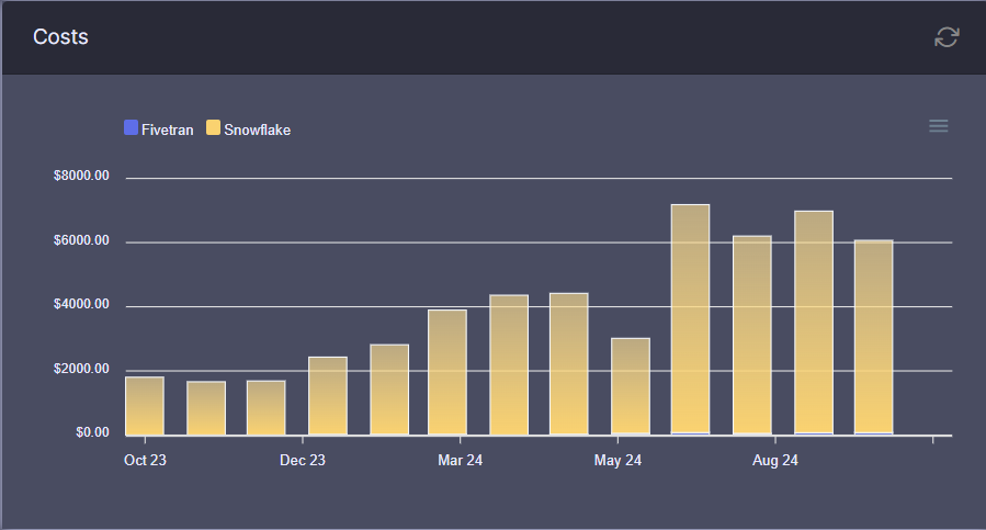
Tracks monthly costs across services:
- Fivetran costs
- Snowflake costs
- Month-by-month comparison
Data Quality Metrics
Exposure Maturity
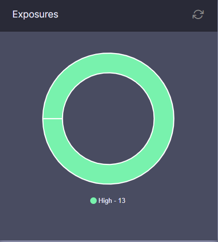
This pie chart shows dbt exposure distribution:
- Current maturity levels
- Percentage breakdown
- Total number of exposures
Data Freshness
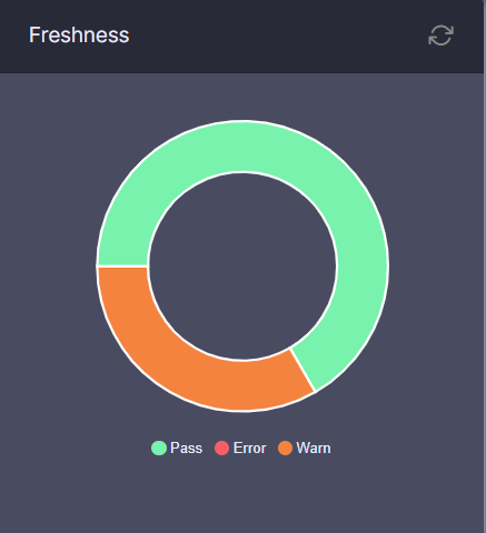
Displays the freshness status of dbt exposures:
- Up-to-date exposures
- Stale data indicators
- Last refresh timestamps
Integration Status
Data Sources Status
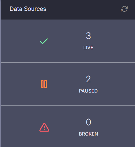
Shows Fivetran connector status:
- Live connections
- Pending setups
- Broken connections
- Total source count
Epic Progress
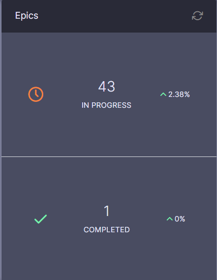
Tracks project epics:
- In-progress epics
- Completed epics
- Month-over-month change percentage
Support Overview
src=/assets/images/support-chart-d03fd51935fea0b141b1f613ca63a595.png
Support Tickets
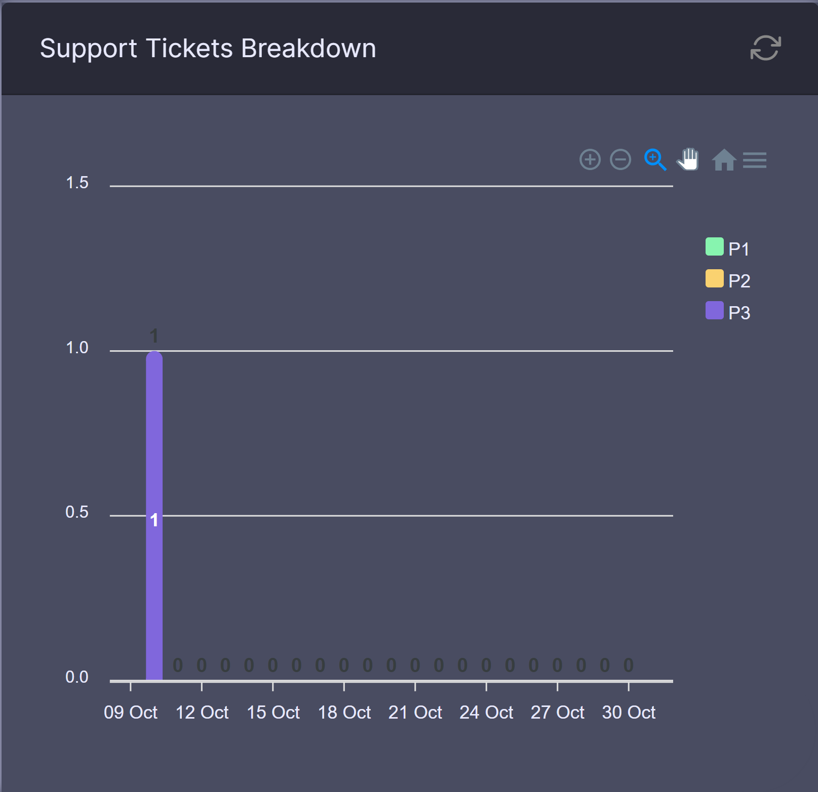
Bar chart showing support ticket distribution:
- Raise date
- Priority levels
- Ticket volume trends
Using the Dashboard
- All charts support date filtering
- Hover over elements for detailed tooltips
- Click legends to toggle data series
Data Refresh
Dashboard data refreshes daily. Last update time shown at the top of the page.